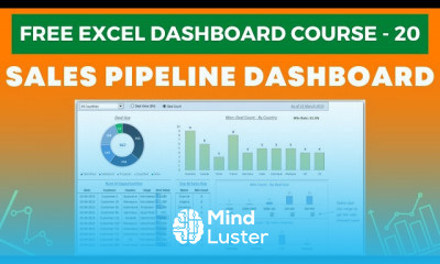
Excel Dashboard Course 3 Excel Tables in Dashboards
Share your inquiries now with community members
Click Here
Sign up Now
Lessons List | 21
Lesson
Comments
Related Courses in Computer Softwares
Course Description
Dashboards in Excel
An Excel dashboard is one-pager (mostly, but not always necessary) that helps managers and business leaders in tracking key KPIs or metrics and take a decision based on it. It contains charts/tables/views that are backed by data. A dashboard is often called a report, however, not all reports are dashboards.How do I create a dashboard in Excel?
Here's a step-by-step Excel dashboard tutorial:
How to Bring Data into Excel. Before creating dashboards in Excel, you need to import the data into Excel. ...
Set Up Your Excel Dashboard File. ...
Create a Table with Raw Data. ...
Analyze the Data. ...
Build the Dashboard. ...
Customize with Macros, Color, and More.How do you create a dashboard?
How to design and build a great dashboard
Be clear about what you're trying to achieve – your board's purpose will inform its design.
Only include what's important – everything should support your board's intent.
Use size and position to show hierarchy – make it clear to the viewer what's most important.How do I create a dynamic dashboard in Excel?
Create a dynamic Excel chart and make your own dashboard
Add a dynamic column to the data range using a HLOOKUP() function. This column will be the chart's real source, not the data range.
Insert a simple chart.
Add a scroll bar control that lets the user easily update the chart's source, without really knowing what's going on behind the scenes.
Trends
Facebook Business Page Settings
Python for AI for beginners
Natural Language Processing with Python
Python programming language
Tools and toolbar in Photoshop for beginners
MS Excel
Learning English Speaking
React Complete Series
English greetings and responses
SUM and SUMIF function in excel
AI fundamentals for beginners
creating a marketing plan tools
Excel skills for busines intermediate
CSS basics for beginners
Neural network optimization techniques
Daily conversational English
Improve english grammar skills
Introduction To Cyber Security
Excel Course Basic to Advanced
Computer architecture
Recent
Python for AI for beginners
Tools and toolbar in Photoshop for beginners
Neural network optimization techniques
SUM and SUMIF function in excel
Machine learning algorithms types
Linux command line essentials
Building a hospital landing page in React JS
Salesforce certified associate
CSS basics for beginners
8x8 LED matrix with arduino for beginners
Building an arduino Light gun basics
Software testing basics for beginners
Video encoding for beginners
Computer security for beginners
Network types for beginners
Compiler optimization techniques
Software engineering basics
Audio editing basics for beginners
FFMPEG advanced techniques
Node based data structures in Java


