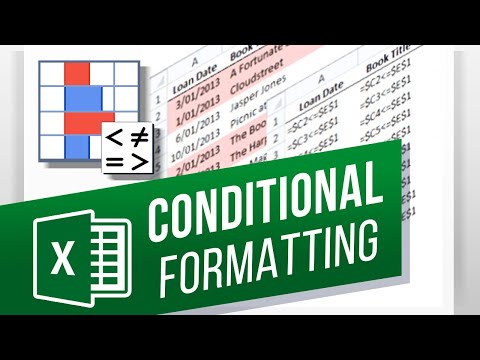
How to Use Conditional Formatting in Excel How to Create a Conditional Formatting Rule in Excel
Share your inquiries now with community members
Click Here
Sign up Now
Lesson extensions
Lessons List | 2
Lesson
Comments
Our New Certified Courses Will Reach You in Our Telegram Channel
Join Our Telegram Channels to Get Best Free Courses
Join Now
We Appreciate Your Feedback
25 Reviews

Monish Raj C

Gopi
Radha Rani
Muhammad Bilal
Show More Reviews
Related Courses in Computer Softwares


Course Description
Create a pareto chart in excel,
in this course we will learn how to find and create a Pareto chart in Excel step by step. You’ll discover how to apply the 80/20 rule to your data using a combination of bar charts and line graphs, making it easy to visualize which factors have the greatest impact. This course will guide you through organizing your data, sorting it in descending order, calculating cumulative percentages, and creating the Pareto chart using Excel’s built-in tools. Whether you're analyzing customer complaints, product defects, or any set of categorical data, this course will help you highlight priorities and make data-driven decisions. It’s perfect for beginners or professionals in quality control, business analysis, and project management. By the end, you’ll be able to create and customize Pareto charts that clearly communicate insights and improve your reporting skills. HOWTECH
Trends
Graphic design tools for beginners
Web Design for Beginners
Accounting Finance course
Best zoology books
Customizing type for logos
Logo Design
Advanced Logo design methods
UX design career in 2025
Graphic Design Basics
Accounting and Bookkeeping fundamentals
Accounting
Web Design 101 Free Full Course
Figma mobile UI design essentials
Web Design Using HTML CSS
Graphic Design | Photoshop
Figma Signing Up and Signing In
Financial Accounting
Figma for UX UI design
Xcode UI design for beginners
Audio Dynamics and Compression techniques
Recent
Bioinformatics basics
Bioinformatics databases
Vitamin A to Z tablets
Best zoology books
Best cream for piles pain
Laser surgery for piles
Best cream for piles
Anal fissure treatment
Best antibiotics for diseases
Antibodies structure
Macrophage structure
Drosophila genetics
Diagnostic tests
Bioinformatics
Genetics
Gene therapy
Kidney structure
DNA replication and types
Bacterial cell structure
Parasite structure