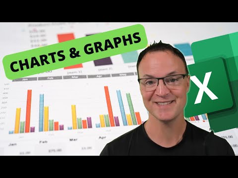
5 Powerful yet Underused Charts in Microsoft Excel for Data Visualization
Share your inquiries now with community members
Click Here
Sign up Now
Lesson extensions
Lessons List | 6
Lesson


Comments
Our New Certified Courses Will Reach You in Our Telegram Channel
Join Our Telegram Channels to Get Best Free Courses
Join Now
We Appreciate Your Feedback
Be the First One Review This Course
0 Reviews
Related Courses in Computer Softwares


Course Description
Creating a bell curve in excel course,
in this course we will learn about creating a bell curve in Excel, a powerful tool for visualizing data distributions. The bell curve, or normal distribution curve, is essential in statistical analysis, helping to represent how data points are distributed around a central mean. We will begin by exploring the theoretical background of the bell curve and its significance in various fields. Then, we’ll dive into practical steps, starting with data entry, calculating key statistical measures like mean and standard deviation, and finally, using Excel’s built-in functions to plot a smooth and accurate bell curve. Throughout the course, we will also cover tips for customizing the curve to match your specific data needs, making it a valuable addition to your analytical toolkit. Whether you're a student, a business professional, or someone who regularly works with data, this course will equip you with the skills to create and interpret bell curves confidently in Excel, enhancing your ability to analyze and present data effectively.
Trends
Creating Kids cartoon video fundamentals
MS Excel
Getting Started with Python
Mobile Apps from Scratch
CMA Accounting basics
Cybersecurity fundamentals for beginners
Video editing with adobe premiere
Formal business english Phrases
Reinforcement learning for game development
Desarrollo con Java
Single dumbbell workouts at home
Test graphic design skills for beginners
Excel Power Query in excel for beginners
Apple cider vinegar health benefits
Python programming language
Business Analytics basics
AutoCAD electrical house wiring for electrical engineers
Writing in english for beginners
Excel microsoft
ONLINE MOBILE SOFTWARE
Recent
English skills with books and movies
Phrasal verbs for Job interviews
Writing in english for beginners
Business english conversations in finance
Formal business english Phrases
Business english stories for beginners
Business English Phrases and Conversations
Business english writing for beginners
Financial english Vocabulary for beginners
Business english meetings for beginners
English grammar for ESL beginners
Job interview in english Preparation
Business english vocabulary for beginners
Business english communication for beginners
Data Science with Python conditions
Reinforcement learning for game development
Machine Learning API development essentials
Building a Forza AI with Python
Deep Learning Projects with Python
Installing OpenCV for Python for beginner