How to Make a Progressive Donut Chart in Excel Automatic and Moderning Look Chart
Share your inquiries now with community members
Click Here
Sign up Now
Lesson extensions
Lessons List | 8
Lesson
Comments
Our New Certified Courses Will Reach You in Our Telegram Channel
Join Our Telegram Channels to Get Best Free Courses
Join Now
We Appreciate Your Feedback
Be the First One Review This Course
0 Reviews
Related Courses in Computer Softwares


Course Description
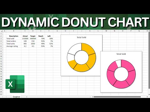
Progressive donut charts in excel course,
in this course we will learn about Progressive Donut Charts in Excel, a versatile tool for visualizing data that progresses through various stages or time periods. We will start by understanding the fundamentals of creating Progressive Donut Charts, which are designed to show how data evolves over time or across different phases. You will learn how to construct these charts step-by-step, from setting up the initial data to designing the chart layers. The course will cover how to customize the appearance of the charts, including adjusting colors, labels, and sizes to highlight key data points. We will also explore techniques for combining multiple layers to display complex datasets and compare different metrics effectively. By the end of this course, you'll be proficient in using Progressive Donut Charts to present dynamic data insights, track progress, and make data-driven decisions with clarity and impact.
Trends
Learning English Speaking
MS Excel
Speak english fluently with confidence
Building a chatbot with Python
Generative AI tools for 2024
Content marketing for beginners
Python programming fundamentals A Z
Creating YouTube videos for beginners
Python programming language
Python machine learning for beginners
Marketing basics for beginners
Cybersecurity fundamentals A Z
Phrasal Verbs in daily conversations
Makeup and Beauty
Tools and toolbar in Photoshop for beginners
Design Thinking
Introduction To Cyber Security
PGP in data science and engineering
Excel Power Query in excel for beginners
Python Programming | Edureka
Recent
Arabic numbers for beginners
Rating arabic handwriting techniques
Form verbal sentences in arabic
Arabic sentence structure for beginners
Phrasal Verbs in daily conversations
Speak english fluently with confidence
Rules for plural forms of irregular nouns
English slang dictionary for fluency
English idioms for everyday conversations
Native english vocabulary for fluency
Teach reading with Phonics for beginners
English speaking confidence techniques
Business english communication skills
American english conversation for beginners
Advanced english listening and vocabulary
English prepositions for beginners
Improve english Pronunciation for beginners
PGP in data science and engineering
Building a chatbot with Python
Python programming fundamentals A Z