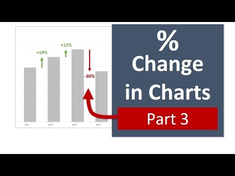
A Column Chart That Displays An Interesting Percentage Change Part 3
Share your inquiries now with community members
Click Here
Sign up Now
Lesson extensions
Lessons List | 3
Lesson
Comments
Related Courses in Computer Softwares
Course Description
Excel for percentage change charts course,
in this course we will delve into the techniques and tools needed to create and interpret percentage change charts in Excel. We will start by understanding the basics of calculating percentage changes, which is essential for comparing data points over time and identifying trends. You’ll learn how to set up your data correctly, ensuring accurate calculations and effective visualizations. We will cover various chart types suitable for displaying percentage changes, such as line charts, bar charts, and area charts, and show you how to customize these charts to highlight key insights.
Through practical examples, you’ll discover how to use Excel formulas and functions, such as =(New Value - Old Value) / Old Value * 100, to calculate percentage changes. We will explore advanced techniques, including adding secondary axes, creating dynamic charts with data validation, and using conditional formatting to enhance your charts' readability. Hands-on exercises will provide you with the experience needed to apply these methods to real-world data sets, enabling you to transform raw data into clear, insightful visualizations.
Trends
Learning English Speaking
MS Excel
Speak english fluently with confidence
Building a chatbot with Python
Generative AI tools for 2024
Content marketing for beginners
Python programming fundamentals A Z
Creating YouTube videos for beginners
Python programming language
Python machine learning for beginners
Marketing basics for beginners
Cybersecurity fundamentals A Z
Makeup and Beauty
Phrasal Verbs in daily conversations
Tools and toolbar in Photoshop for beginners
Design Thinking
Introduction To Cyber Security
PGP in data science and engineering
Excel Power Query in excel for beginners
Python Programming | Edureka
Recent
Arabic numbers for beginners
Rating arabic handwriting techniques
Form verbal sentences in arabic
Arabic sentence structure for beginners
Phrasal Verbs in daily conversations
Speak english fluently with confidence
Rules for plural forms of irregular nouns
English slang dictionary for fluency
English idioms for everyday conversations
Native english vocabulary for fluency
Teach reading with Phonics for beginners
English speaking confidence techniques
Business english communication skills
American english conversation for beginners
Advanced english listening and vocabulary
English prepositions for beginners
Improve english Pronunciation for beginners
PGP in data science and engineering
Building a chatbot with Python
Python programming fundamentals A Z


