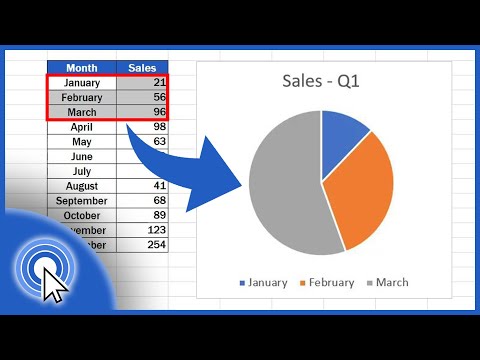
How to Create a Doughnut Chart in Excel Quick and Easy
Share your inquiries now with community members
Click Here
Sign up Now
Lesson extensions
Lessons List | 9
Lesson


Comments
Our New Certified Courses Will Reach You in Our Telegram Channel
Join Our Telegram Channels to Get Best Free Courses
Join Now
We Appreciate Your Feedback
2 Reviews

Hubab Khan

Dr.Ghvs Sarma
Show More Reviews
Related Courses in Computer Softwares


Course Description
Creating histograms in excel course,
in this course we will learn about creating histograms in Excel, a powerful tool for data analysis and visualization. Histograms allow us to graphically represent the distribution of a data set, making it easier to identify patterns, trends, and outliers. We will start with the basics, including how to organize your data, select appropriate bin ranges, and use Excel's built-in tools to generate histograms. The course will cover both manual methods and the use of Excel's Analysis ToolPak for more advanced histogram features. You will learn how to customize your histograms by adjusting bin widths, adding labels, and formatting the chart for better presentation. Additionally, we will explore practical applications of histograms in various fields, such as business, science, and education, demonstrating how this tool can help make informed decisions based on data insights. By the end of this course, you will be proficient in creating and interpreting histograms in Excel, enabling you to handle your data with greater ease and efficiency. Whether you are a beginner or an experienced user looking to enhance your skills, this course provides comprehensive instruction and practical tips for mastering histograms in Excel.
Trends
Management from A to Z
Learning English Speaking
MS Excel
Python programming language
Digital Marketing From Scratch
Adobe illustrator tools for designers
a Road Using Civil 3D
Ethical Hacking
Digital Marketing
Complete WIFI Hacking Course Beginner to Advanced
Mobile Apps from Scratch
Photo Editing
Graphic design rules for beginners
Human Resource Management
Email Marketing
C Programming Language
Organization of Microcontroller
Human Resource Management in Public Service for mangers
Advanced Soil Mechanics course
SEO for business growth for beginners
Recent
Deep Learning Projects with Python
Installing OpenCV for Python for beginner
Video editing with adobe premiere
Mastering adobe Illustrator CC basics
Create a website with wordPress for beginner
AI deep reinforcement Learning in Python
Kotlin programming essentials bootcamp
Brainstorming on data science
Python mySQL database connection
Model deployment on unix for beginners
Data Science knowledge test
Data science mock interview basics
Deep Learning interview questions
VIF application in python for beginners
Data science basics quiz
NLP and generative AI for beginners
Linux command essentials from scratch
Aws for data science basics
Website security basics
SEO for business growth for beginners