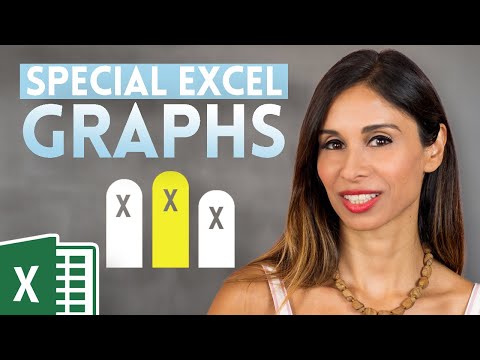
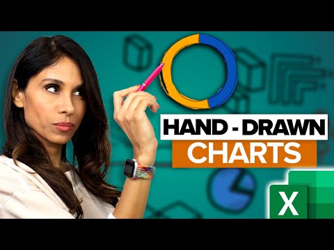
The Secret to Making Hand Drawn Charts in Excel
Share your inquiries now with community members
Click Here
Sign up Now
Lesson extensions
Lessons List | 12
Lesson


Comments
Our New Certified Courses Will Reach You in Our Telegram Channel
Join Our Telegram Channels to Get Best Free Courses
Join Now
We Appreciate Your Feedback
Be the First One Review This Course
0 Reviews
Related Courses in Computer Softwares


Course Description
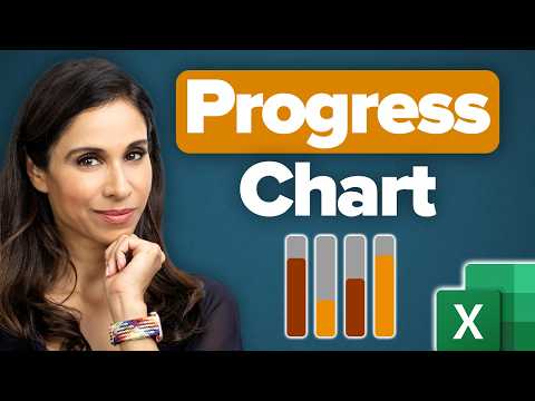
Creating infographics in excel course,
in this course you'll learn how to leverage the capabilities of Excel to design visually captivating and informative infographics. We will begin by covering the fundamentals of data visualization and the essential principles of effective infographic design. You’ll explore how to use Excel’s charts, shapes, icons, and formatting tools to transform raw data into clear and compelling visual narratives. We'll delve into advanced techniques for customizing charts, incorporating images, and adding interactive elements to enhance your infographics. Additionally, you'll learn how to use color schemes and typography effectively to make your data stand out. By the end of this course, you'll be equipped with the skills to create professional-quality infographics in Excel that effectively communicate your data insights. Join us to master the art of creating engaging infographics in Excel and elevate your data presentation to new heights.
Trends
MS Excel
Learning English Speaking
WiFi hacking
Adobe illustrator tools for designers
Ethical Hacking
Python programming language
Mobile Apps from Scratch
Logo Programming for beginners
Python in Hindi
Excel Course Basic to Advanced
Cybersecurity
Complete WIFI Hacking Course Beginner to Advanced
Graphic design rules for beginners
Ethical Hacking
Embedded Systems ES
Accounting Finance course
Web Design for Beginners
Building graphic design portfolio from scratch
Downloading and installing tux paint for kids
Microsoft Excel How to course
Recent
Adobe illustrator tools for designers
Graphic design rules for beginners
Isometric design in illustrator for beginners
Psychology in graphic design for beginners
Test graphic design skills for beginners
Plugins for adobe Illustrator designers
Logo design tools in illustrator for beginners
Illustrator keyboard shortcuts for beginners
Building graphic design portfolio from scratch
Audacity download and installation for beginners
Downloading and installing tux paint for kids
Building a race game in scratch for beginners
Sharing links in edmodo for beginners
Google sheets dynamic chart techniques
Building a CV website from scratch
Designing logos in google drawings for beginners
Converting PDF to google docs for beginners
Google slides text masking essentials
Inserting images in microsoft word for beginners
Hosting images on google drive for beginners